Power BI Report Templates: Why Standardization Matters for Teams
Learn how to establish Power BI report templates that reinforce branding, improve consistency, and scale reporting across your team.
👉 Next in this series: Creating a Custom Power BI Theme: Aligning Reports with Your Brand
When you step into a new leadership role — whether you’re joining an existing team or building one from the ground up — one of the most overlooked but high‑impact actions you can take is to establish reporting standards early.
Reports are more than numbers on a page. They’re the language your team uses to communicate performance, progress, and priorities. Without consistency, that language quickly becomes fragmented, and the story gets lost.
Once you’ve set the foundation with templates, the next step is to create a create a custome Power BI theme so your visuals align with your brand colors and fonts.
🎯 Why Power BI Report Templates Matter
Clarity and Consistency
A well‑defined template ensures that every report looks and feels the same, regardless of who creates it. This reduces friction for your audience and makes insights easier to digest.Professional Identity
Reports are often the most visible artifacts of your team’s work. By embedding corporate colors, logos, and design standards, you reinforce your organization’s identity and credibility.Efficiency
Templates save time. Instead of reinventing the wheel, your team can focus on the analysis and insights that matter most.Scalability
As your team grows, standardized templates make it easier to onboard new members and maintain quality across deliverables.
🖌️ Branding in Power BI Report Templates
A good measure of whether your templates are effective is whether they reflect your corporate brand. That means:
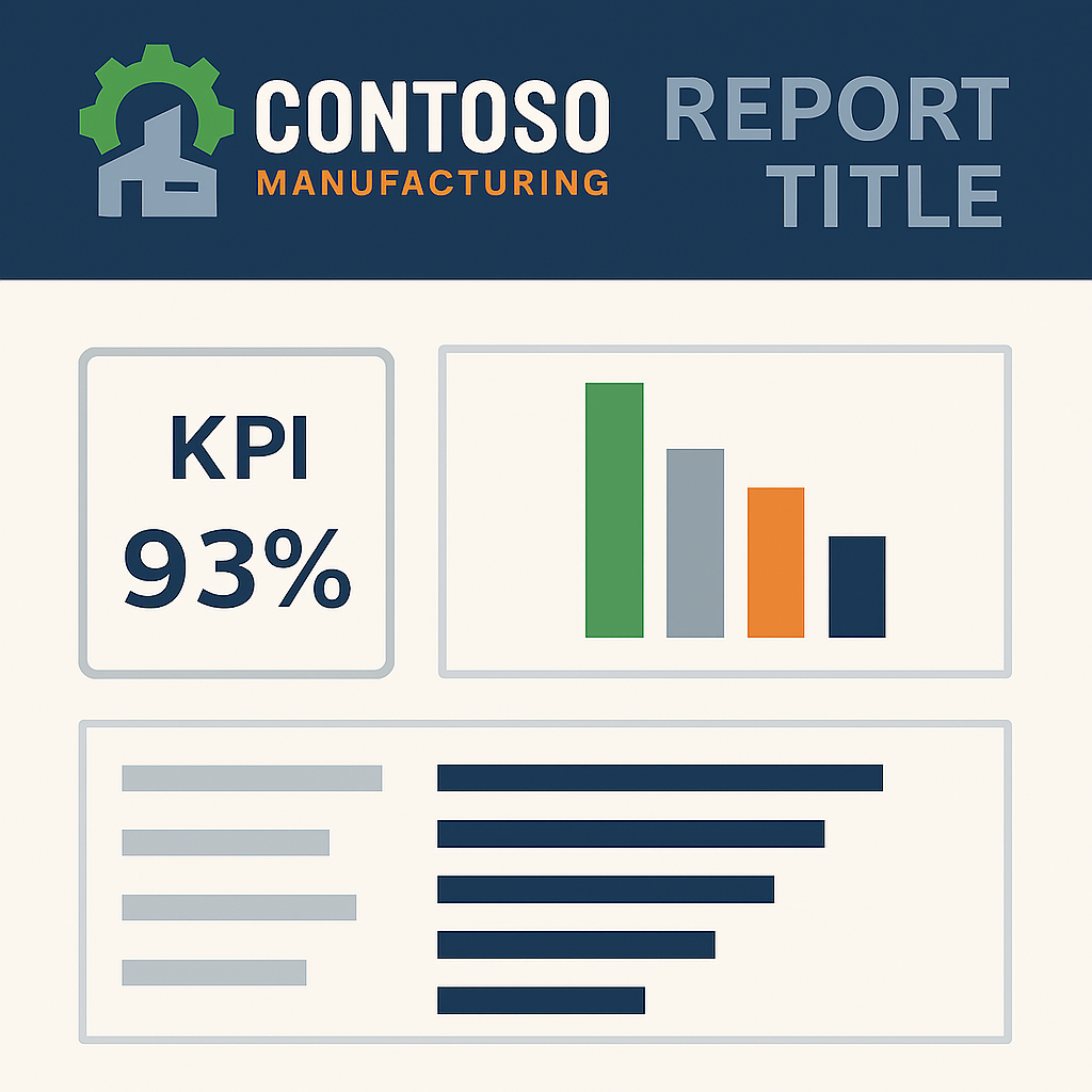
- Using the approved color palette (e.g., Contoso Manufacturing’s steel blue, machine green, and safety orange).
- Incorporating the company logo in headers or footers.
- Applying consistent typography and layout rules.
These design choices may seem cosmetic, but they send a powerful signal: this work is official, reliable, and aligned with the organization’s values.
You can reinforce this by designing Power BI backgrounds and icons in PowerPoint to extend branding into every report page.
🚀 How to Create Power BI Report Templates (Step‑by‑Step)
- Audit existing reports — identify inconsistencies in style, structure, and branding.
- Define a core template — include title pages, KPI cards, charts, and notes sections.
- Apply corporate colors and logos — ensure every report feels like part of the same family.
- Document usage guidelines — so your team knows when and how to apply the template.
- Iterate with feedback — refine the template as your team’s needs evolve.
✅ Final Thoughts on Power BI Report Templates
When you first join or lead a team, setting up reporting templates may not feel urgent compared to immediate deliverables. But it’s one of those foundational moves that pays dividends over time. By aligning your reports with corporate branding and creating a consistent framework, you empower your team to communicate with clarity, professionalism, and impact.
❓ Frequently Asked Questions about Power BI Report Templates
Why are report templates important in Power BI?
Report templates ensure consistency in layout, branding, and structure across dashboards, making insights easier to consume and compare.
How do I create a reusable report template in Power BI?
You can design a report with your preferred visuals, layouts, and themes, then save it as a .pbit template file for reuse.
Can report templates include corporate branding?
Yes. Templates can embed logos, color palettes, and typography so every report reflects your organization’s identity.
What’s the difference between a template and a theme?
A theme controls colors and fonts, while a template includes layout, visuals, and design elements. Together, they create a complete branded experience.