Creating a Custom Power BI Theme: Aligning Reports with Your Brand
Learn how to create a custom Power BI theme with JSON, colors, fonts, and filter pane settings to align reports with your brand.
One of the fastest ways to elevate the professionalism of your Power BI reports is by applying a custom theme. A theme ensures that every chart, KPI card, and table reflects your organization’s identity — from the color palette to the typography — creating consistency and credibility across reports.
👉 Microsoft provides a detailed guide on using and importing custom report theme files. In Power BI Desktop, you’ll find these options under View → Themes, where you can select a built‑in theme, customize the current one, or import your own JSON file.
In this post, I’ll show you how to build a custom theme from scratch — using Contoso Manufacturing as an example — so your reports align seamlessly with your brand.
If you haven’t already, start by establishing report templates to give your team a consistent reporting framework.
📐 Step 0 — Align Power BI Themes with Brand Standards
Before you define colors yourself, check if your company’s marketing or design team already has brand guidelines.
- Many organizations maintain official palettes, typography rules, and accessibility standards.
- Using these ensures your reports match the same look and feel as presentations, websites, and customer‑facing materials.
- If you can get the official hex codes and fonts, you’ll save time and guarantee consistency.
🧭 Step 1 — Open the Power BI Customize Theme Dialog
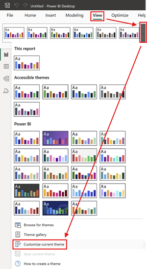
Before diving into JSON or advanced edits, start by opening the built‑in Customize Theme dialog. This ensures you know exactly where theme settings live in the Power BI interface.
- Open Power BI Desktop and load the report you want to style.
- On the ribbon, select the View tab.
- In the Themes group, click the dropdown arrow.
- Choose Customize current theme… from the menu.
This opens the Customize theme dialog box. From here you can adjust colors, fonts, backgrounds, and visual styles interactively. It’s the fastest way to experiment with branding and immediately see changes ripple across your report.
💡 Tip: Even if your end goal is a polished JSON theme file, starting here helps you preview design choices visually before exporting and refining them in code.
🎨 Step 2 — Define Your Power BI Theme Color Palette
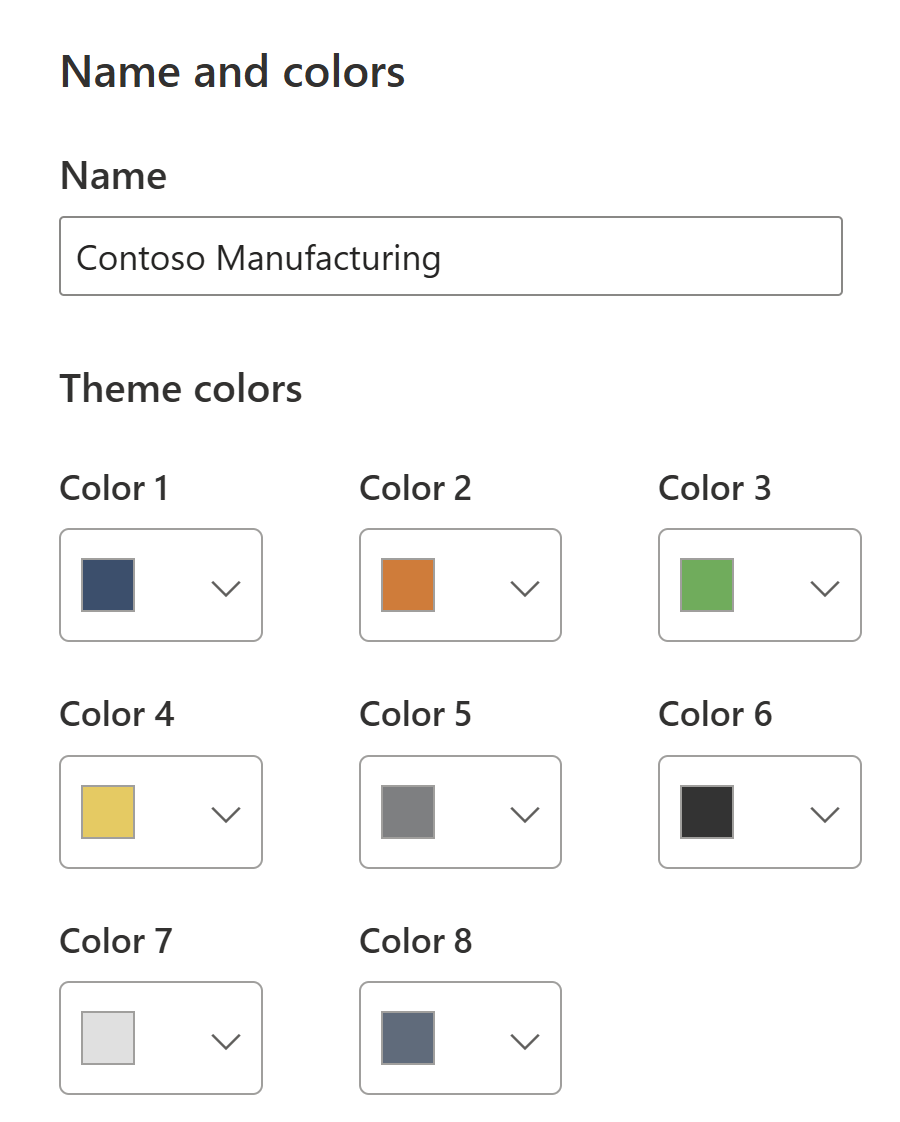
Start by identifying the 8 base colors that will cycle through visuals. For Contoso Manufacturing, we chose:
- Steel Blue
#2F4F6F - Safety Orange
#E87722 - Machine Green
#4CAF50 - Energy Yellow
#F2C94C - Industrial Gray
#7D7F81 - Charcoal
#333333 - Concrete Light
#E0E0E0 - Accent Blue Gray
#5A6B7D
🖌️ Step 3 — Configure Sentiment and Divergent Colors in Power BI
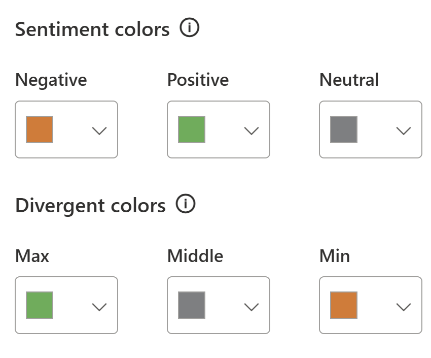
Power BI allows you to define sentiment colors (positive, negative, neutral) and divergent colors (for variance scales). For example:
- Positive: Machine Green
#4CAF50 - Negative: Safety Orange
#E87722 - Neutral: Industrial Gray
#7D7F81
Divergent scale: Orange → Gray → Green.
✒️ Step 4 — Customize Power BI Theme Fonts and Text
In the Text tab of the Customize Theme dialog, you can set defaults for all the typography in your report. This ensures consistency across visuals without manually formatting each one.
Key options include:
- Title text — font family, size, weight, and color for visual titles.
- Header text — used in tables, matrices, and slicers.
- Label text — axis labels, data labels, and category labels.
- Tooltip text — the small pop‑ups that appear when hovering over data points.
For Contoso Manufacturing, we chose Segoe UI (to align with Microsoft branding), bold for titles, medium weight for headers, and a consistent dark gray #333333 for readability.
📊 Step 5 — Set Default Visual Styles in Power BI
The Visuals tab lets you define how different chart types and objects should look by default. This is powerful because it saves your team from repetitive formatting.
Examples of what you can set:
- Charts — default line thickness, marker shapes, and legend placement.
- Tables & Matrices — gridline color, header background, alternating row shading.
- Cards & KPIs — font size, alignment, and callout value color.
- Slicers — orientation (horizontal/vertical), background, and border style.
By setting these once in the theme, every new visual inherits the same polished look — no more “Frankenstein” reports where each chart looks different.
🖼️ Step 6 — Configure Power BI Page Backgrounds
Finally, the Page tab controls the canvas itself:
- Background color — the default fill behind visuals.
- Wallpaper — an image or texture that sits behind the report page.
- Transparency — adjust how much of the background shows through.
For Contoso, we kept the background white (#FFFFFF) for clarity, but added a subtle gray wallpaper with 5% transparency to give reports a professional, branded feel without distracting from the data.
For more advanced layouts, you can design custom backgrounds and icons in PowerPoint and apply them instead of or in addition to what is set here.
💡 Tip: Keep page backgrounds subtle. High‑contrast or busy images can make charts hard to read.
🔍 Step 7 — Customize the Power BI Filter Pane
The Filter Pane is where users interact with report filters, so it deserves the same branding attention as visuals and text.
In the Filter Pane tab of the Customize Theme dialog, you can set:
- Pane background — the overall container color.
- Pane font color — the default text color.
- Available filter cards — filters not yet applied (e.g., “Region = All”).
- Applied filter cards — filters currently active (e.g., “Region = North America”).
For Contoso Manufacturing, we used a light gray background with dark gray text, and highlighted applied filters with a subtle accent border. This makes it easy for users to see which filters are driving the report at a glance.
💡 Tip: Keep applied filters visually distinct but not overwhelming. A subtle accent color works better than a bold fill, which can distract from the report itself.
💾 Step 8 — Export and Edit the Power BI Theme JSON
Once you’ve finished experimenting in the Customize Theme dialog, you can export your settings to a JSON file. This gives you full control and makes your theme portable.
- In Power BI Desktop, go to View → Themes → Save current theme.
- Save the file as
contoso-theme.json. - Open the JSON in a text editor (VS Code, Notepad++, etc.).
Here you can refine details beyond what the UI exposes — for example, adding custom visual styles, adjusting font weights, or defining additional color properties.
💡 Tip: Keep your JSON well‑formatted and commented. It becomes a living design asset your team can maintain over time.
📥 Step 9 — Import Your Custom Power BI Theme
After refining your JSON, bring it back into Power BI:
- In Power BI Desktop, go to View → Themes → Browse for themes.
- Select your updated
contoso-theme.json. - Watch as your visuals instantly adopt the new palette, fonts, and formatting defaults.
This step closes the loop: you’ve gone from UI → JSON → back into Power BI with a fully branded theme.
🌐 Step 10 — Apply Power BI Themes Consistently
A theme only delivers value if it’s used consistently. To embed it into your team’s workflow:
- Standardize — Share the JSON file in a central repository (SharePoint, Teams, GitHub).
- Template reports — Pair the theme with a Power BI template (
.pbit) that includes logos, headers, and footers. - Governance — Document when and how to apply the theme so every analyst follows the same rules.
- Enablement — Train your team on how to import and use the theme, so adoption is frictionless.
By applying the theme across all reports, you ensure every dashboard feels like part of the same brand story — professional, consistent, and credible.
Once your theme is in place, you can enhance interactivity by using Power BI Bookmarks for storytelling and navigation
📝 Step 11 — Example Power BI JSON Theme File
Here’s a simplified JSON snippet:
1
2
3
4
5
6
7
8
9
10
11
12
13
14
15
16
17
18
19
20
21
22
{: file="contoso-theme.json" }
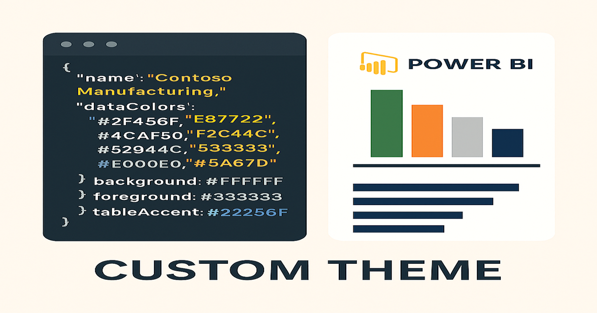
{
"name": "Contoso Manufacturing",
"dataColors": [
"#2F4F6F", "#E87722", "#4CAF50", "#F2C94C",
"#7D7F81", "#333333", "#E0E0E0", "#5A6B7D"
],
"sentimentColors": {
"positive": "#4CAF50",
"negative": "#E87722",
"neutral": "#7D7F81"
},
"divergentColors": {
"minimum": "#E87722",
"center": "#7D7F81",
"maximum": "#4CAF50"
},
"background": "#FFFFFF",
"foreground": "#333333",
"tableAccent": "#2F4F6F"
}
✅ Final Thought
A custom Power BI theme is more than a design choice — it’s a leadership move. By aligning reports with your corporate identity, you create clarity, consistency, and credibility. Your team’s insights will not only be accurate, but also unmistakably yours.
❓ Frequently Asked Questions about Power BI Themes
What is a Power BI theme?
A theme is a JSON file that defines report colors, fonts, and formatting defaults, ensuring consistent branding across visuals.
How do I create a custom Power BI theme?
Use the Customize Theme dialog in Power BI Desktop, then export and refine the JSON file for advanced control.
Can I share a theme across multiple reports?
Yes. Once exported, a theme JSON can be imported into any report to maintain a unified look.
How do I style the filter pane in Power BI?
In the Customize Theme → Filter Pane section, you can set background, text, and card styles for available and applied filters.